
Introduction
Everyone who has heard the old saying “a picture is worth a thousand words” appreciates its simple wisdom. With Oracle databases you have situations where a graph of the output of a SQL query is easier to understand than the standard text output. It’s helpful to have a simple way to graph Oracle data, and Python has widely used libraries that make it easy.
This post describes a Python script that graphs data from an Oracle database using the Matplotlib graphics library. The script uses three widely used Python libraries: cx_Oracle, NumPy, and Matplotlib. This post provides a simple and easily understood example that can be reused whenever someone needs to graph Oracle data. It is written as a straight-line program without any functions or error handling to keep it as short and readable as possible. It demonstrates the pattern of cx_Oracle -> NumPy -> Matplotlib and the use of Matplotlib’s object-oriented approach.
Here is an example graph:
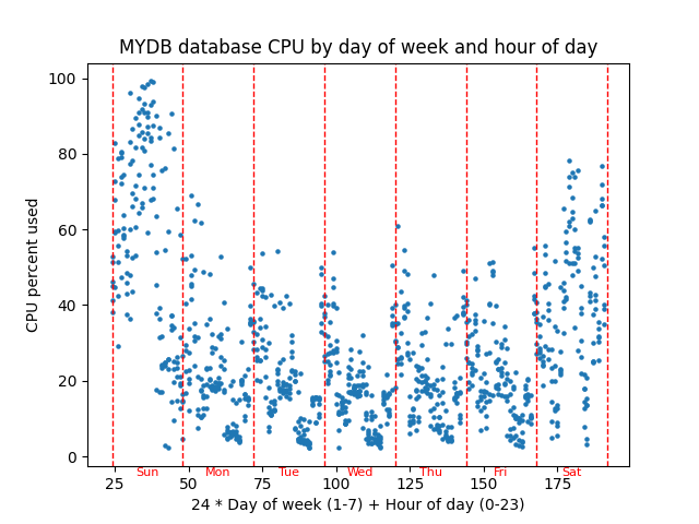
The script graphs database server percent CPU used versus a combination of the day of week and the hour of the day to see if there is any pattern of CPU usage throughout a typical week. This graph has about 6 weeks of hourly AWR snapshots graphed in a scatter plot with CPU percentage on the Y axis and (24 * day of week) + hour of day as the X axis. You could think of the X axis as the hour of the week. This graph might be helpful in performance tuning because it shows whether CPU usage follows a weekly pattern.
Here is the current version of the script: scatter.py.
The script has three main parts which correspond to the three non-internal Python libraries that I use:
- cx_Oracle – Query the CPU data from an Oracle database
- NumPy – Massage query data to get it ready to be graphed
- Matplotlib – Graph the data
These libraries all have lots of great documentation, but Matplotlib’s documentation is confusing at first. At least it was for me. Here are three useful links:
Quick start – This is a great overview. The picture of the “Parts of a Figure” is helpful. I don’t know if earlier versions of Matplotlib had this picture.
Axes – This is a nice list of all the methods of an Axes object. Most of the code in the example script involves calling these methods. I have trouble finding these methods using a Google search, so I bookmarked this link.
Figure – The example script does not call any Figure object methods, but I wanted to document where to find them here. I bookmarked this URL as well as the Axes one because a Matplotlib graph is composed of at least one Figure and Axes object. With the Quick start link and these two lists of methods you have all you need to write Matplotlib scripts.
cx_Oracle
The query for this graph pulls operating system CPU metrics from the DBA_HIST_OSSTAT view and uses them to calculate the percent of the time the CPU is busy. It is made of two subqueries in a with statement and the final main query.
with
myoscpu as
(select
busy_v.SNAP_ID,
busy_v.VALUE BUSY_TIME,
idle_v.VALUE IDLE_TIME
from
DBA_HIST_OSSTAT busy_v,
DBA_HIST_OSSTAT idle_v
where
busy_v.SNAP_ID = idle_v.SNAP_ID AND
busy_v.DBID = idle_v.DBID AND
busy_v.INSTANCE_NUMBER = idle_v.INSTANCE_NUMBER AND
busy_v.STAT_NAME = 'BUSY_TIME' AND
idle_v.STAT_NAME = 'IDLE_TIME'),
The myoscpu subquery pulls the CPU busy and idle times from the view along with the snapshot id. I think these are totals since the database last came up, so you have to take the difference between their values at two different points in time to get the CPU usage for that time.
myoscpudiff as
(select
after.SNAP_ID,
(after.BUSY_TIME - before.BUSY_TIME) BUSY_TIME,
(after.IDLE_TIME - before.IDLE_TIME) IDLE_TIME
from
myoscpu before,
myoscpu after
where before.SNAP_ID + 1 = after.SNAP_ID
order by before.SNAP_ID)
The myoscpudiff subquery gets the change in busy and idle time between two snapshots. It is built on myoscpu. My assumption is that the snapshots are an hour apart which is the case on the databases I work with.
select
to_number(to_char(sn.END_INTERVAL_TIME,'D')) day_of_week,
to_number(to_char(sn.END_INTERVAL_TIME,'HH24')) hour_of_day,
100*BUSY_TIME/(BUSY_TIME+IDLE_TIME) pct_busy
from
myoscpudiff my,
DBA_HIST_SNAPSHOT sn
where
my.SNAP_ID = sn.SNAP_ID
order by my.SNAP_ID
The final query builds on myoscpudiff to give you the day of the week which ranges from 1 to 7 which is Sunday to Saturday, the hour of the day which ranges from 0 to 23, and the cpu percent busy which ranges from 0 to 100.
import cx_Oracle
...
# run query retrieve all rows

connect_string = username+'/'+password+'@'+database
con = cx_Oracle.connect(connect_string)
cur = con.cursor()

cur.execute(query)

# returned is a list of tuples
# with int and float columns
# day of week,hour of day, and cpu percent

returned = cur.fetchall()
...
cur.close()
con.close()
The cx_Oracle calls are simple database functions. You connect to the database, get a cursor, execute the query and then fetch all the returned rows. Lastly you close the cursor and connection.
print("Data type of returned rows and one row")
print(type(returned))
print(type(returned[0]))

print("Length of list and tuple")
print(len(returned))
print(len(returned[0]))

print("Data types of day of week, hour of day, and cpu percent")
print(type(returned[0][0]))
print(type(returned[0][1]))
print(type(returned[0][2]))
I put in these print statements to show what the data that is returned from fetchall() is like. I want to compare this later to NumPy’s version of the same data. Here is the output:
Data type of returned rows and one row
<class 'list'>
<class 'tuple'>
Length of list and tuple
1024
3
Data types of day of week, hour of day, and cpu percent
<class 'int'>
<class 'int'>
<class 'float'>
The data returned by fetchall() is a regular Python list and each element of that list is a standard Python tuple. The list is 1024 elements long because I have that many snapshots. I have 6 weeks of hourly snapshots. Should be about 6*7*24 = 1008. The tuples have three elements, and they are normal Python number types – int and float. So, cx_Oracle returns database data in standard Python data types – list, tuple, int, float.
So, we are done with cx_Oracle. We pulled in the database metric that we want to graph versus day and hour and now we need to get it ready to put into Matplotlib.
NumPy
NumPy can do efficient manipulation of arrays of data. The main NumPy type, a ndarray, is a multi-dimensional array and there is a lot of things you can do with your data once it is in an ndarray. You could do the equivalent with Python lists and for loops but a NumPy ndarray is much faster with large amounts of data.
import numpy as np
...
# change into numpy array and switch columns
# and rows so there are three rows and many columns
# instead of many rows and three columns

dataarray = np.array(returned).transpose()

# dataarray[0] is day of week
# dataarray[1] is hour of day
# dataarray[2] is cpu percent
The function np.array() converts the list of tuples into a ndarray. The function transpose() switches the rows and columns so we now have 3 rows of data that are 1024 columns long whereas before we had 1024 list elements with size 3 tuples.
I added print statements to show the new types and numbers.
print("Shape of numpy array after converting returned data and transposing rows and columns")
print(dataarray.shape)

print("Data type of transposed and converted database data and of the first row of that data")
print(type(dataarray))
print(type(dataarray[0]))

print("Data type of the first element of each of the three transposed rows.")
print(type(dataarray[0][0]))
print(type(dataarray[1][0]))
print(type(dataarray[2][0]))
Here is its output:
Shape of numpy array after converting returned data and transposing rows and columns
(3, 1024)
Data type of transposed and converted database data and of the first row of that data
<class 'numpy.ndarray'>
<class 'numpy.ndarray'>
Data type of the first element of each of the three transposed rows.
<class 'numpy.float64'>
<class 'numpy.float64'>
<class 'numpy.float64'>
The shape of a ndarray shows the size of each of its dimensions. In this case it is 3 rows 1024 columns as I said. Note that the overall dataarray is a ndarray and any given row is also. So, list and tuple types are replaced by ndarray types. Also, NumPy has its own number types such as numpy.float64 instead of the built in int and float.
Now that our CPU data is in a NumPy array we can easly massage it to the form needed to plot points on our graph.
# do 24 * day of week + hour of day as x axis

xarray = (dataarray[0] * 24) + dataarray[1]

# pull cpu percentage into its own array

yarray = dataarray[2]
My idea for the graph is to combine the day of week and hour of day into the x axis by multiplying day of week by 24 and adding hour of the day to basically get the hours of the week from Sunday midnight to Saturday 11 pm or something like that. The nice thing about NumPy is that you can multiply 24 by the entire row of days of the week and add the entire row of hour of the day all in one statement. xarray is calculated in one line rather than writing a loop and it is done efficiently.
Here are some print statements and their output:
print("Shape of numpy x and y arrays")
print(xarray.shape)
print(yarray.shape)
Shape of numpy x and y arrays
(1024,)
(1024,)Now we have two length 1024 ndarrays representing the x and y values of the points that we want to plot.
So, we have used NumPy to get the data that we pulled from our Oracle database using cx_Oracle into a form that is ready to be graphed. Matplotlib works closely with NumPy and NumPy has some nice features for manipulating arrays of numbers.
Matplotlib
Now we get to the main thing I want to talk about, which is Matplotlib. Hopefully this is a clean and straightforward example of its use.
import matplotlib.pyplot as plt
...
# get figure and axes

fig, ax = plt.subplots()
First step is to create a figure and axes. A figure is essentially the entire window, and an axes object is an x and y axis that you can graph on. You can have multiple axes on a figure, but for a simple graph like this, you have one figure, and one axes.
# point_size is size of points on the graph

point_size = 5.0
...
# graph the points setting them all to one size

ax.scatter(xarray, yarray, s=point_size)
This actually graphs the points. A scatter plot just puts a circle (or other shape) at the x and y coordinates in the two arrays. I set all points to a certain size and figured out what size circle would look best by trying different values. Note that scatter() is a method of the Axes type object ax.
# add title

ax.set_title(database+" database CPU by day of week and hour of day")

# label the x and y axes

ax.set_xlabel("24 * Day of week (1-7) + Hour of day (0-23)")
ax.set_ylabel("CPU percent used")
More methods on ax. Sets title on top center of graph. Puts labels that describe the x axis and the y axis.
# add vertical red lines for days

for day_of_week in range(8):
    ax.axvline(x=(day_of_week+1)*24, color='red', linestyle='--',linewidth=1.0)
The previous lines are all I really needed to make the graph. But then I thought about making it more readable. As I said before the X axis is basically the hour of the week ranging from 24 to 191. But I thought some red lines marking the beginning and end of each day would make it more readable. This puts 8 lines at locations 24, 48,…,192. I set the linewidth to 1.0 and used the dashes line style to try to keep it from covering up the points. I think axvline means vertical line on Axes object.
# Calculate the y-coordinate for day names
# It should be a fraction of the range between the minimum and maximum Y values
# positioned below the lower bound of the graph.
# The minimum and maximum CPU varies depending on the load on the queried database.

lower_bound = ax.get_ylim()[0]
upper_bound = ax.get_ylim()[1]
yrange = upper_bound - lower_bound
fraction = .025
y_coord = lower_bound - (fraction * yrange)

xloc = 36

for day in ['Sun','Mon','Tue','Wed','Thu','Fri','Sat']:
    ax.text(xloc, y_coord, day, fontsize=8, color='red', ha='center',fontweight='ultralight')
    xloc += 24
I kept messing with the script to try to make it better. I didn’t want to make it too complicated because I wanted to use it as an example in a blog post. But then again, this code shows some of the kinds of details that you can get into. The text() method of ax just puts some text on the graph. I made it red like the dashed lines and tried to make the letters light so they wouldn’t obscure the main parts of the graph. The x coordinates were just the center of the word and essentially the middle of the day. The first day starts at x=24 so 12 hours later or x=36 would be halfway through the day, approximately. I just had a list of the three-character day names and looped through them bumping the x location up by 24 hours for each day.
But the y coordinate was more complicated. I started out just choosing a fixed location for y like -5. For one database this worked fine. Then I tried another database, and it was way off. The reason is that Matplotlib scales the y coordinates based on the graphed data. If your database’s cpu is always around 30% then the range of visible y coordinates will be close to that. If your database’s cpu varies widely from 0% to 100% then Matplotlib will set the scale wide enough so the entire range 0 to 100 is visible. So, to put the text where I wanted it, just below the y axis line, I needed to make it a percentage of the visible y range below the lowest visible value. The get_ylim() method shows the calculated lower and upper bounds of the y axis which were calculated based on the y values of the graphed points. I manually messed with the value for the variable fraction until it looked right on the screen. Then I ran the script with a variety of databases to make sure it looked right on all of them.
# show graph

plt.show()
Lastly you just show the graph. Note that like the subplots() call this is not a method of an axes or figure object but just a matplotlib.pyplot call. Everything else in this example is a call to a method of the ax Axes type object.
Conclusion
This post shows how to graph Oracle database data using Python libraries cx_Oracle, NumPy, and Matplotlib. It first shows how to pull Oracle data into Python’s native data structures like lists and tuples. Then it shows how to convert the data into NumPy’s ndarrays and manipulate the data so that it can be graphed. Lastly it shows how to use Matplotlib Axes object methods to graph the data and add useful elements to the graph such as labels, vertical lines, and text.
This is a simple example, and all the software involved is free, open-source, widely used, easy to install, and well-documented. Give it a try!

For people starting out, it’s worth noting that cx_Oracle was renamed to python-oracledb in 2022. The API is effectively the same. cx_Oracle is now obsolete.
One of the recent new features in python-oracledb 3.0 is the ability to fetch directly into dataframes via the use of Arrow-backed datatypes e.g. like:
sql = “select sal from emp”
odf = connection.fetch_df_all(statement=sql, arraysize=100)
pyarrow_array = pyarrow.array(odf.get_column_by_name(“SAL”))
np = pyarrow_array.to_numpy()
print(type(np))
print(np)
which will print:
[ 800. 1600. 1250. 2975. 1250. 2850. 2450. 3000. 5000. 1500. 1100. 950.
3000. 1300.]
Thanks for your comment Christopher. I need to look into the 3.0 version of python-oracledb. I have used python-oracledb on Linux but still have the older CX_Oracle on my work laptop and haven’t updated it yet. Need to get both up to python-oracledb 3.0.
Thanks again for your input!
Bobby