I ran across a stackoverflow question and it gave me an idea for a simpler use of Python to graph some Oracle database performance information. I looked at my PythonDBAGraphs scripts and I’m not sure that it is worth modifying them to try to simplify those scripts since I like what they do. But they may make people think that Python scripts to graph Oracle performance data are difficult to write. But, I think if someone just wants to put together some graphs using Python, Matplotlib, and cx_Oracle they could do it more simply than I have in my PythonDBAGraphs scripts and it still could be useful.
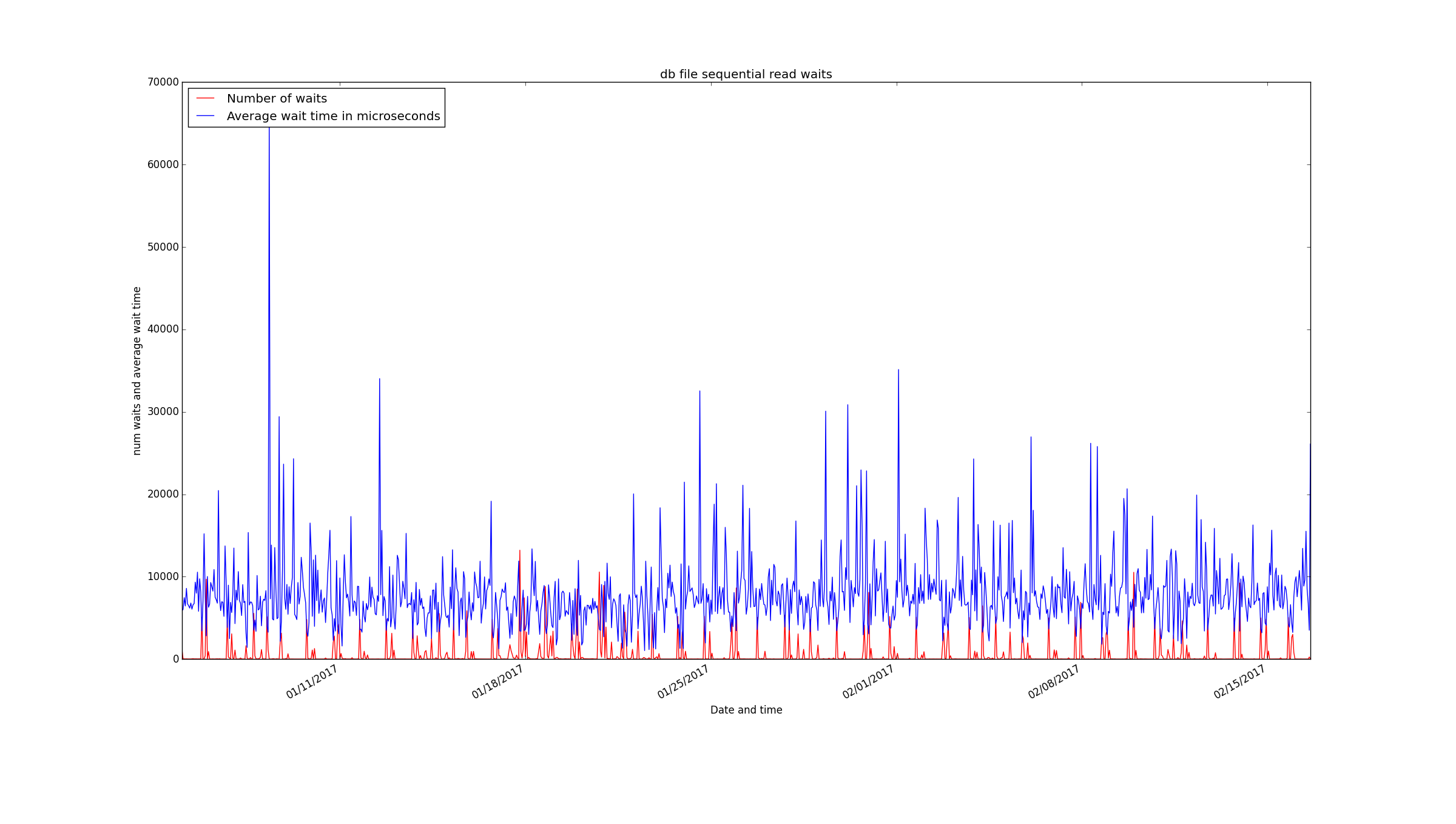
Here is an example that looks at db file sequential read waits and graphs the number of waits per interval and the average wait time in microseconds:
import cx_Oracle
import matplotlib.pyplot as plt
import matplotlib.dates as mdates

connect_string = "MYUSER/MYPASSWORD@MYDATABASE"
con = cx_Oracle.connect(connect_string)
cur = con.cursor()

query="""
select sn.END_INTERVAL_TIME,
(after.total_waits-before.total_waits) "number of waits",
(after.time_waited_micro-before.time_waited_micro)/
(after.total_waits-before.total_waits) "ave microseconds"
from
DBA_HIST_SYSTEM_EVENT before,
DBA_HIST_SYSTEM_EVENT after,
DBA_HIST_SNAPSHOT sn
where before.event_name='db file sequential read' and
after.event_name=before.event_name and
after.snap_id=before.snap_id+1 and
after.instance_number=1 and
before.instance_number=after.instance_number and
after.snap_id=sn.snap_id and
after.instance_number=sn.instance_number and
(after.total_waits-before.total_waits) > 0
order by after.snap_id
"""

cur.execute(query)

datetimes = []
numwaits = []
avgmicros = []
for result in cur:
    datetimes.append(result[0])
    numwaits.append(result[1])
    avgmicros.append(result[2])

cur.close()
con.close()

title="db file sequential read waits"

fig = plt.figure(title)
ax = plt.axes()

plt.plot(datetimes,numwaits,'r')
plt.plot(datetimes,avgmicros,'b')

# Format X axis dates

fig.autofmt_xdate()
ax.fmt_xdata = mdates.DateFormatter('%m/%d/%Y %H:%M')
datetimefmt = mdates.DateFormatter("%m/%d/%Y")
ax.xaxis.set_major_formatter(datetimefmt)

# Title and axes labels

plt.title(title)
plt.xlabel("Date and time")
plt.ylabel("num waits and average wait time")

# Legend

plt.legend(["Number of waits","Average wait time in microseconds"],
loc='upper left')

plt.show()
The graph it produces is usable without a lot of time spent formatting it in a non-standard way:
It is a short 68 line script and you just need matplotlib and cx_Oracle to run it. I’ve tested this with Python 2.
Bobby


Thanks for sharing & its nice & clear explanation.
Would be great if same work capture in small video. so that it will be great for quick reference of your video library.
Always your article has great meanings.
Thanks,
Mohammed.
Thanks for your comment. I am glad that the post was helpful.
Thanks for your great demo about Oracle performance and viewing with Python.
This is exactly the right stack for analyzing “Engineering Data” .
Thanks for your comment.
hi Bobby , Is it worth learning python for oracle dba or you think r is better?
Thanks for your question. I can’t really say much about R because I have not used it. Python is supposed to be easier to learn and use than most languages so it probably would be better than R for quick scripts that a DBA would write. I’m not a full time developer so I don’t write code every day. It is nice to have a simpler language to fall back on when I want to write something. The other thing about Python is that Amazon Web Services uses it so if you are likely to do a cloud project it might help you to know Python. Maybe if you are doing a bunch of stuff with statistics and big data you might want to learn R, but I haven’t used it.
Great work. Keep it up bobby
Thanks!
Pingback: Modified PythonDBAGraphs to use datetime on X axis | Bobby Durrett's DBA Blog
Nice! Thank you
You’re welcome. I’m glad that this information is helpful.