I have been having trouble using WordPress on this blog. I keep having long lines wrapped instead of having a slider that readers can use to see the end of the lines. Also, pictures that looked fine when I posted them later look squished together. Yuck.
Long Lines
First, I will try to put some longer lines of output here using the preformatted type of block:
SQL_ID        PLAN_HASH_VALUE END_INTERVAL_TIME         EXECUTIONS_DELTA Elapsed Average ms CPU Average ms IO Average ms Cluster Average ms Application Average ms Concurrency Average ms Average buffer gets Average disk reads Average disk write megabytes Average rows processed

 6kmnq0uj99a3c        65249283 09-MAR-21 01.00.03.869 PM               80         178.420588        163.875             0                  0                      0                      0          13345.9375                  0                            0                  829.6
 6kmnq0uj99a3c        65249283 09-MAR-21 02.00.32.536 PM               80         171.877913        159.875             0                  0                      0                      0          13122.1375                  0                            0               816.0125
 6kmnq0uj99a3c        65249283 09-MAR-21 03.00.01.160 PM               81         174.509975     159.876543             0                  0                      0                      0          13145.2346                  0                            0             818.111111
 6kmnq0uj99a3c        65249283 09-MAR-21 04.00.29.556 PM               83         180.367157     164.939759             0                  0                      0                      0          13286.4337                  0                            0             825.843373
 6kmnq0uj99a3c        65249283 09-MAR-21 05.00.56.089 PM               40           26.11575           21.5        1.9689                  0                      0                      0               915.7              3.425                            0                     51
Notice how it wraps around and looks unreadable. I could swear that either a preformatted or a code block did not wrap in the recent past. Here is the same text in a code block:
SQL_ID        PLAN_HASH_VALUE END_INTERVAL_TIME         EXECUTIONS_DELTA Elapsed Average ms CPU Average ms IO Average ms Cluster Average ms Application Average ms Concurrency Average ms Average buffer gets Average disk reads Average disk write megabytes Average rows processed
------------- --------------- ------------------------- ---------------- ------------------ -------------- ------------- ------------------ ---------------------- ---------------------- ------------------- ------------------ ---------------------------- ----------------------
6kmnq0uj99a3c        65249283 09-MAR-21 01.00.03.869 PM               80         178.420588        163.875             0                  0                      0                      0          13345.9375                  0                            0                  829.6
6kmnq0uj99a3c        65249283 09-MAR-21 02.00.32.536 PM               80         171.877913        159.875             0                  0                      0                      0          13122.1375                  0                            0               816.0125
6kmnq0uj99a3c        65249283 09-MAR-21 03.00.01.160 PM               81         174.509975     159.876543             0                  0                      0                      0          13145.2346                  0                            0             818.111111
6kmnq0uj99a3c        65249283 09-MAR-21 04.00.29.556 PM               83         180.367157     164.939759             0                  0                      0                      0          13286.4337                  0                            0             825.843373
6kmnq0uj99a3c        65249283 09-MAR-21 05.00.56.089 PM               40           26.11575           21.5        1.9689                  0                      0                      0               915.7              3.425                            0                     51
Basically, the same problem although font and background are different. One thing I have done in the past is use a GitHub Gist. I would paste the text into a gist and put the URL inline like this:
https://gist.github.com/bobbydurrett/792f10405a7c4c6acbf965abc31ad3c6
This no longer seems to work. I had to go back and change a bunch of posts with links like this to embed the gist in the posts. To do that I had an amusing set of steps:
- Create a new Paragraph block
- Add one space
- Choose Edit as HTML
- Paste in embedded gist between the <p> and </p>
Example of what I have to paste in:
<p><script src="https://gist.github.com/bobbydurrett/792f10405a7c4c6acbf965abc31ad3c6.js"></script></p>Here are the long lines as an embedded gist:
It would be great if there were a simpler way to do this. Maybe there is.
Pictures
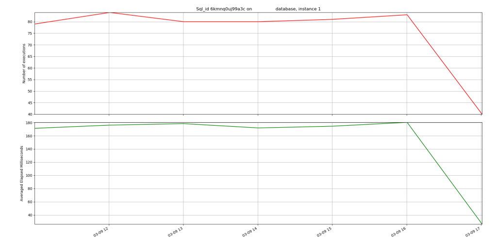
The second challenge is that when I paste in screenshots, they get all squished. Here is a graphical version of the same type data:

The picture is not square, so it gets squished in. It is nice that you can click on it and see the big version, but I would like it to not be so ugly beforehand.

Thumbnail is 150 x 150 and very small.

75% is still squished

50% is not squished but the text is small. At least you can click on it and the big version pops up.

As I am writing this I realize there is a guide that you can click on to manually size the picture and it shows you have far to the right you can size it before it starts getting squished.
So, I guess for now I am stuck with either making my text lines short enough to fit or sticking them in a Gist. For images I just need to size them with the little tool to keep them within the margins, so they do not get pushed in to fit.
Bobby

