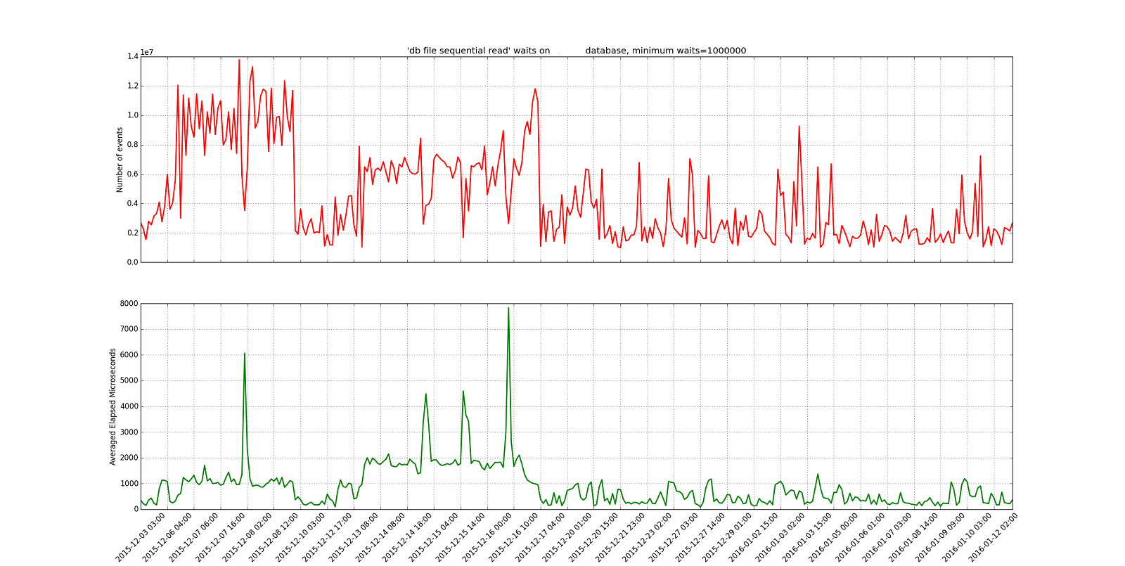
Here is another graph that I created in Python with Pyplot:
This is onewait.py in my PythonDBAGraphs repository. myplot.py has the plotting code. db.py has the database access code.
I blanked out the database name in the example graph to hide it.
This is a graphical version of my onewaitevent.sql script. It queries the AWR looking at a particular wait event per hour. You look at the number of wait events in an hour to see how busy the system was and then the average elapsed time for that hour. Also, you set the smallest number of waits to include so you can drop hours where nothing is going on.
In the example graph you can find times where the average time for a db file sequential read is high and the system is busy. You use the top graph to see how busy the system is and the bottom to see where the average time spikes.
Still just an experiment but I thought I would pass it along. It isn’t that hard to create the graph in Python and I seem to have a lot of flexibility since I’m writing code instead of using an existing program like Excel.
Bobby
P.S.
4/26/2021
Updated the links to point to the current version of the same code.


Great post. Thank you!
Does your script create graph from ash/dash data to drill events and connectons together
Thank you for your question. This script just queries the AWR views to see waits by hour. I have other scripts that use ASH. See the repository https://github.com/bobbydurrett/PythonDBAGraphs
Bobby